
There's a wide variety of khaki tones. The origins are from British soldiers in India dying their summer whites ["India Whites" to US Army] using tea, coffee, mud, curry powder, or colored inks, etc to get the khaki [dust-colored] color. So there is a huge variety of color tones, including: Lavender to blue, dark to light grey, and brown to tan to sand to off-white [Osprey's "The British Army on Campaign (3), 1856-1881" p.23].
In 1885 a color-fast version of the khaki was implemented in the entire Army in India [so British and Native soldiers alike] which undoubtedly brought more uniformity to the uniform...no pun intended [Osprey's "The British Army on Campaign (4), 1882-1902" p.24].
A few examples are below, including actual museum pieces [with dummies], replicas [with re-enactors], and color plates from Barthrop's "The Frontier Ablaze" [which is a wonderful book, btw]. As these were from Pinterest, it's hard to trace the sources - if you've any to add, just put them in Comments below, Thanks!


These two both Barthrop.


1900, 1910, 1914 khaki in Osprey's "Indian Army Regiments".
So, all well and good. We've reproductions, we've museum pieces, and artistic interpretations, but what does this come down to for the Wargamer and Painter?
AIP sells its figs in groups of 20 Infantry that are typically ten poses, so two of each. They could quite realistically represent detachments from several regiments who are foraging, patrolling, etc, so even in a skirmish setting could have uniform variations.
This brings in the issue of game scale, as in how many people each figure represents, and what size formation the figure group / Unit represents, as it will affect game mechanics. For example, most wargames use a 1:20 ratio and will have a 480 fig battalion that looks like a platoon, but moves like a regiment in mechanics, altho the weapon ranges will usually be exaggerated so that it seems like a company of Soldiers.
My intent is to do skirmishing, so either 1:1 or up to 1:5, where a "unit" of ten is 10-50 men. This will provide a hot spot for the Soldiers to do their thing up close and personal. Think of it as "The Sword and the Flame" style, but with much simpler mechanics and no bathtubbing.
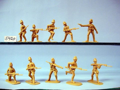
So for the first Unit, I've ten primed and ready figs from the Box 5423, "British Army on Campaign, Northwest Frontier 1985-1902, British Infantry" one of each pose:
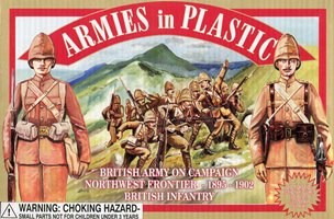
https://www.armiesinplastic.com/northwest-frontier.html
Have to say, this is JUST what the little fellas look like - love it!
So it's time to think of some varying color palettes for each "Unit" of Soldiers, whether they are in Units of 10, 20, 40, whatever. My rule for actual painting colors is:
- visible to the eye and a couple of feet,
- strong contrasts to show color variations in articles of clothing / gear,
- look right to scale [usually means brighter than in real life]
- easy to work with [so water-based whenever possible]
- ability to stand up to the Miracle Dip in various shades
This has produced servicable and - sometimes - complimented miniatures that have been pleasing over the years.
What might that look like with this first batch?
First, I did some paint samples against the - large - bases, which of course are primed the same as the figure - plus they are quite large.
- Left fig has a light grey at 6 and the khaki I'm using for my15mm British Desert Rats at 3 - it is GW Commano Khaki, but I've mixed other stuff from Vallejo in it.
- Right fig has Vellejo Lt. Brown at 12, an anonymous Polly-S brown at 3, Vallejo Dark Sand at 6, Butternut at 7, and Buff at 9.
Notice how the Vallejo Dark Sand almost disappears - it's a very near match to the primer.

There's also a sampling of the blue for the blue serve trousers - obviously, a white prime on them isn't the way to go. But I prefer the one on the left.
At this point, I'm leaning to a Vallejo Dark Sand coat, khaki puttees, and lt grey or off-white straps. I may give the officer a buff coat - just to show his custom tayloring - and the butternut actually looks like a good flesh color...
Well, that's all for now - off to Cold Wars to sell off a bunch of stuff and check out the occasional game!
No comments:
Post a Comment
Thanks for your comment! t will be posted after it's moderated.